Freelance Client: Team Gallagher
Project: Team Logo
Project Overview: This freelance project was energetic and fun. A unifying identity was created for Team Gallagher's gear and swag for the Pole, Pedal, Paddle Race in Oregon. The client asked for the symbol to represent his family's east coast nautical roots. The overall style was to be inspired by the vintage cycling jerseys from the 70's.
Role: Designer, Client Liaison
Photo of Water by Jeremy Bishop
Photo of Cyclists by Boris Stefanik
In-House: WSECU (Washington State Employees CU)
Project: Refreshing WSECU’s visuals and copy.
Project Overview: Working with 30+ departments and 100+ branded assets, the marketing and creative teams partnered together to achieve a successful brand refresh that spanned throughout the state of Washington.
Strategy & Planning: I collaborated closely with the copywriter and branch managers to ensure we understood our diverse target audience and to maintain brand consistency. Planned closely with marketing coordinators in order to meet strategic goals and tight timelines.
Results: The process remained smooth due to proper communication and planning between teams. Under my brand stewardship, the visuals and copy maintained brand consistency throughout the 100+ assets and a 360 marketing campaign to announce the change.
Role: Creative Team Lead, Art Director, Designer, Client Liaison
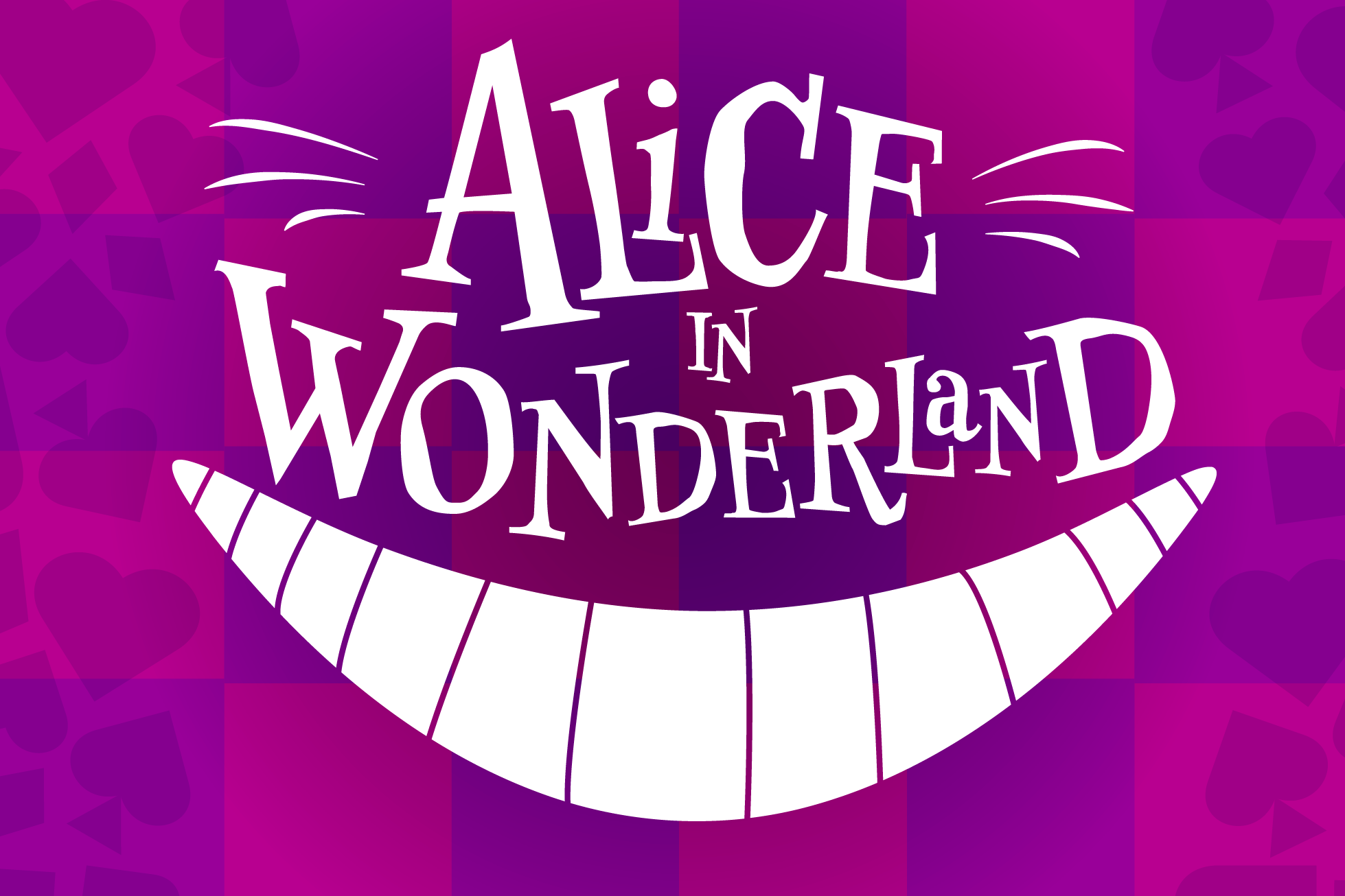
Skills Showcase: Interview at Stone Soup Theater
Project: Redesign one of the current key arts on Stone Soup Theater’s website. I selected Alice in Wonderland with the mission to create a fun design for the children's theater production.
Strategy & Planning: My research included reviewing other web image locations, Alice in Wonderland inspiration and noting potential marketing channels and merchandise. My strategy was to keep the design simple, playful and flexible for all media.
Results: The design and interview led to a job offer.
Role: Designer
Project: Brand Refresh
In-House: Geocaching HQ
Project Overview: Geocaching HQ's in-house creative team undertook updating Geocaching's brand. The creative brief: Develop a brand that would take the geocaching community beyond the everyday. The targeted audience is everyone.
Design Concept: With 7 million global members and creators, the creative solutions needed to be flexible for a wide variety of assets and audience. Identity, icons, colors, typefaces, visuals and copy were all meticulously and strategically reviewed. This included updating the 4-color logo to a simplified one color palette, a more inclusive variety of photography and modern, relevant illustrations.
From ideation to planning, I led the creative team through the process while cross-collaborating with other departments. I worked closely with Marketing and PR to establish clear communication about the brand refresh to our audience.
Results: The new visuals, media and tone attracted a more diverse, international audience. Happily, I have observed that eight years later, the original concept of illustrations over photography is still being employed. This serves as proof that the strategic branding decisions made with geocaching were sound.
Role: Creative Direction, Art Direction, Co- Designer, Project Management, Stakeholder Management
Freelance Client: Pompomtastic
Project: Identity for pompom accessories and wreath maker
Role: Designer, Client Liaison
Freelance Client: Coconut Client
Project: Identity for SoCal clothing company
Role: Designer, Client Liaison
s+aa Client: Pashah
Project: Identity for NYC hair salon
Role: Art Director, Designer
In-House: WSECU
Project: Identities for Internal Departments
Role: Designer, Stakeholder Liaison
In-House: Washington State Employees CU (WSECU)
Project: Invitation
Project Overview: Create an invitation for the ribbon cutting event to celebrate the new WSECU HQ building. It was sent out to members and the community.
Design Concept: To pay homage to the modern architecture of the new building—including many large windows—I designed the invitation to be minimal and bright.
Role: Designer, Stakeholder Management
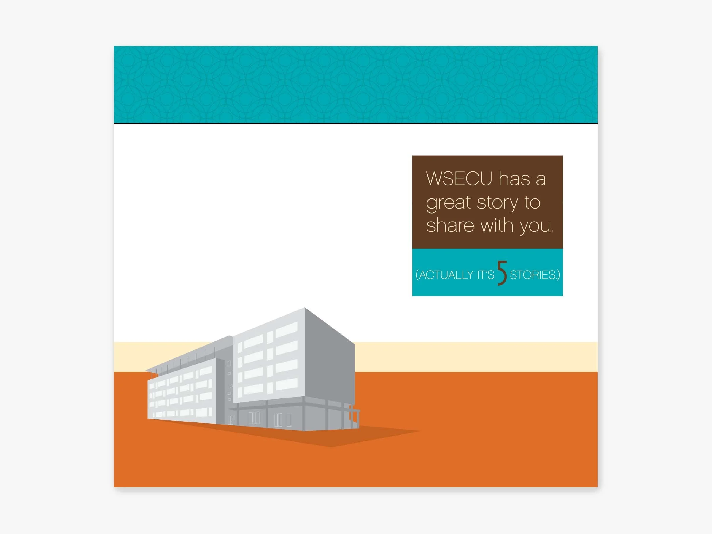
In-House: WSECU (Washington State Employees CU)
Project: Annual Report
Project Overview: In 2009, the new WSECU HQ building was completed and moved into. It played an important role in that year's annual report’s theme. Final provided in both print and digital pdf formats.
Role: Designer, Stakeholder Management
Freelance Client: Habitat for Humanity
Project: Auction Invitations, Marketing Assets and Programs
Project Overview: Habitat for Humanity needed various assets created for Habitat for Humanity's annual event, Blueprints & Blue Jeans, aimed at raising funds for building homes for economically disadvantaged families. This fun theme encouraged attendees to wear jeans (fancy or not!) for the event.
Design Concept: In addition to the invitations and programs, I proposed the innovative idea of screen printing the event details on jeans and hanging them in downtown business windows. This creative approach not only served as an advertisement but also added a unique flair to the event's promotion.
Execution: To keep costs down, I spearheaded a jeans donation drive and successfully collected 100 pairs. Each pair was then screen-printed with event details and displayed in downtown Olympia shop windows, generating buzz and excitement throughout the community.
Outcome: The jeans-advertisement campaign proved to be a resounding success, becoming the talk of downtown Olympia and significantly boosting awareness for the Blueprints & Blue Jeans event. The initiative not only garnered attention but also showcased the community's support for Habitat for Humanity's noble cause.
Key Takeaways: This project underscored the power of creativity and community engagement in fundraising efforts. By thinking outside the box and mobilizing local resources, we were able to effectively promote the event while keeping costs at a minimum, ultimately contributing to the success of Habitat for Humanity's mission.
Role: Designer, Client Liaison
In-House: Washington State Employees CU (WSECU)
Project: Direct Mailer
Project Overview: Every year, WSECU hosts Shred Day throughout several Washington locations. I was asked to convey the love the credit union members have for this day and its benefits.
Design Concept: Combining the members’ love of the event with the physical representation of shredded paper was a fun concept for this direct mailer and other marketing collateral.
Role: Designer, Stakeholder Management
A collection of comp and final designs for various projects, clients, and opportunities, showcasing my ability to adapt to different styles.
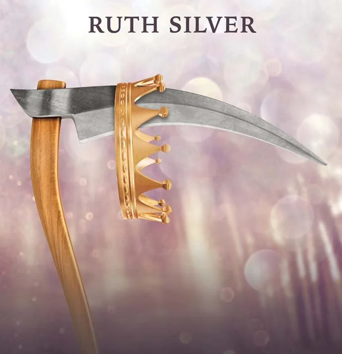
Client: Booktrope
Project: Book Covers
Project Overview: I created seven different book covers with indie publisher Booktrope. All covers are created for both print and e-book images (i.e. Amazon and iBooks). These two are some of my favorites from the bunch. I worked remotely with the author, editor and marketing lead.
Role: Design, Author Liaison
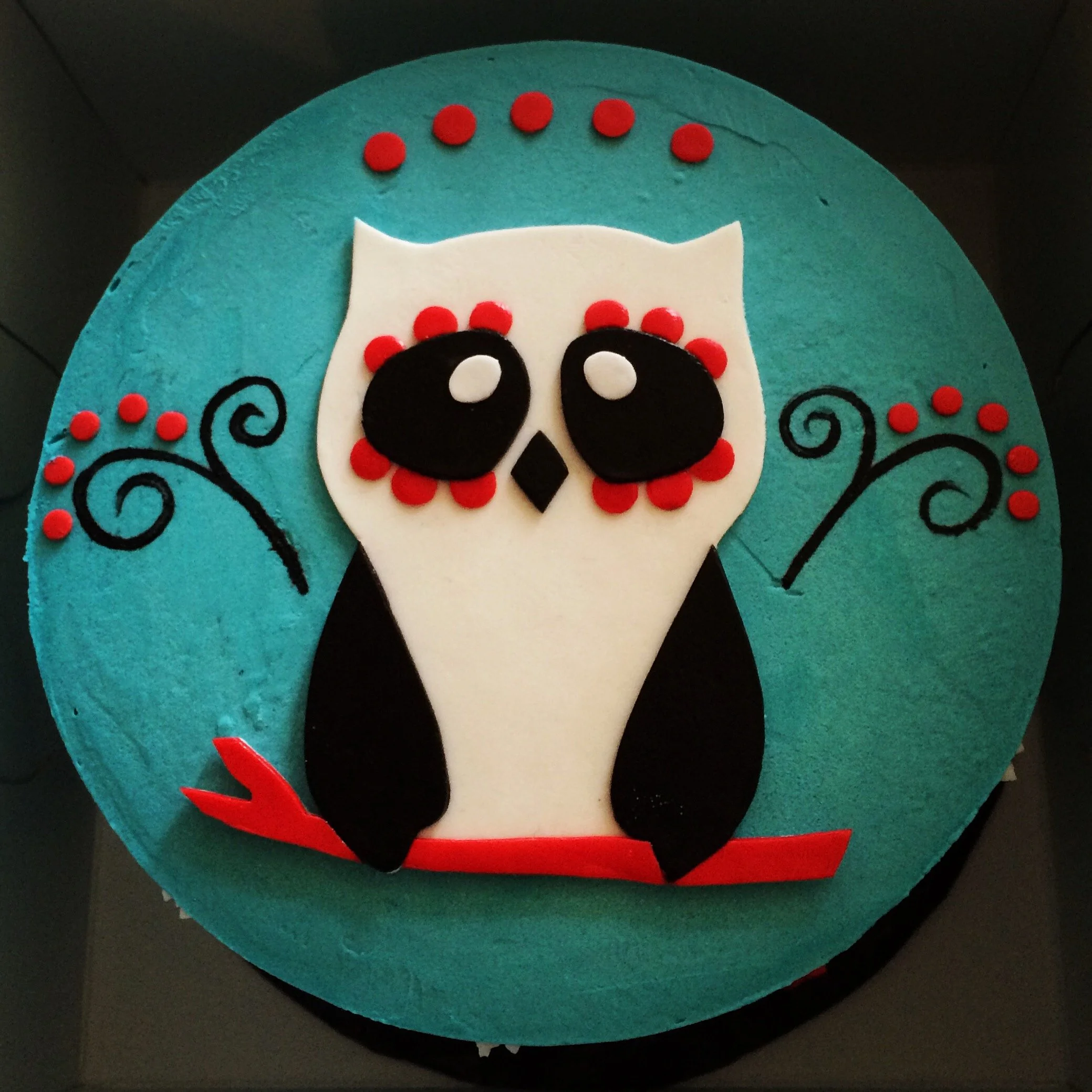
Inspired by Día de los Muertos and owls, I designed my son's first birthday cake. It was a hard choice between the red and the teal themes, but we eventually landed on the teal design. Cake created by a bakery in West Seattle.
Client: Mahina Hawley Photography
Project: Identity Branding
Project Overview: Mahina approached the project with a clear vision: she wished for her identity to reflect simplicity and sophistication without feeling too rigid. She also wanted to stand out from the other competitors.
Design Concept: The symbol featured clean lines, reflecting the simplicity she sought, while also softening the edges with rounded corners. This added a more approachable feeling to its overall appearance. A review of local competitor identities confirmed that her logo would be easily recognizable.
Execution: In the execution phase, we meticulously refined the symbol, ensuring that every curve and line contributed to the desired impression. The simple color palette of black and white not only complemented Mahina's beautiful photography but also ensure that her logo remains visible on digital and printed assets.
Role: Designer, Client Liaison
Photo of Pine by Annie Spratt
Photo of Child by Mahina Hawley
In-House: Geocaching HQ
Project: Geocaching HQ Annual Block Party
Project Overview: GC HQ hosts an annual block party that geocachers from around the world travel to Seattle to attend. The creative brief asked that the design include elements of a geocaching party, the Seattle area, and adventure while keeping it cohesive with HQ's recently rebranded visuals. Collateral included posters, t-shirts, invitations, geocoins, tags and a microsite.
Execution: The creative team collaborated on ideation through brainstorming and daily check-ins. GC’s talented in-house designers created assets that was energetic and matched the joyous nature of the block party.
Role: Creative Direction, Art Direction, Project Management, Stakeholder Management